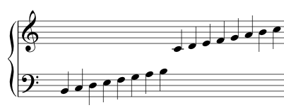
The vertical positioning is almost correct, although every dot should be either exactly between two lines, or exactly vertically centred on a line. The top F is OK (assuming this is a treble stave) but by the time you reach the E at the bottom of the clef, positioning errors have accumulated and it's difficult to tell at a glance where the note is supposed to be.
Horizontally, I would say that a musician would normally expect the notes to be more widely spaced.
Typesetting music is analogous to typesetting words. You can reasonably easily come up with something that isn't "wrong", but is the music equivalent of a printing an essay in Courier New.
You can go a step further and get something that's the musical equivalent of using a nicer font, but being naive about kerning and aliasing.
To get something that's comparable to a professionally produced score -- or the typesetting of something like TeX -- that's the domain of people who are both extremely talented software developers and musicians and to some extent artists.
Most software that produces stave output doesn't aspire to that level of quality, mind you. Stuff like GarageBand or Cubase is somewhere in the middle. Lilypond aims high, but acknowledges that perfection is a long way off. Sibelius aims high, and gets the brightest and best to work on it.


