Before drawing conclusions from a spectrogram of this type, it's important to understand the limitations of the algorithm being used -- in particular, the errors that are present in a DFT of this type.
Errors in Apparent Power
Using Audacity, this is what a perfect, computer-generated 82.09Hz sine wave looks like.
(Feel free to try this yourself, using Audacity's Generate->Tone function):
Notice how wide the spectrum is. We can be sure that this is not due to dispersive effects, because we know beforehand that the wave is perfect (neglecting quantization error and so forth); it was generated by a computer.
If I change the frequency just a bit, to 80.75Hz, the resulting peak is considerably more narrow, and the noise floor drops away:
And, just for comparison, a wave of the same amplitude, but at 6000Hz:
Note that all waves were generated at the exact same amplitude (0dB, or "1.0" in Audacity). As a factual matter, they all contain essentially the same power. It is the DFT representation that is so misleading.
I chose those frequencies because they have a particular relationship to the frequency "bins" present in the DFT.
I will not go into a detailed explanation of DFT principles here, but basically, these differences arise from a complex interaction between:
- The sample rate
- The actual frequency being played
- The DFT size (number of samples)
- The amount of audio being analyzed (the length of the recording)
- The choice of "window function" (this item has a particularly outsize effect. Audacity has several to choose from)
- The fact that the OP is trying to represent a DFT with over 16,000 data points on an image which is only 1300 pixels wide. Some points are being omitted.
For all the plots above, I used a 16384-sample DFT, 44100Hz sample rate, and a "Hamming" window function. This is based on an educated guess about what the OP is using.
TL;DR:
The bottom line is that it's difficult to compare the total power in two different waves by estimating the area under the graph, in a log/log DFT spectrum like this. Just because the fundamental has a wide peak, does not mean it has more power than taller, narrower peaks. It is entirely possible the OP actually does have less power in his fundamental tone.
Analysis
The actual reason for the louder 3rd overtone is likely a combination of several factors already mentioned in other answers.
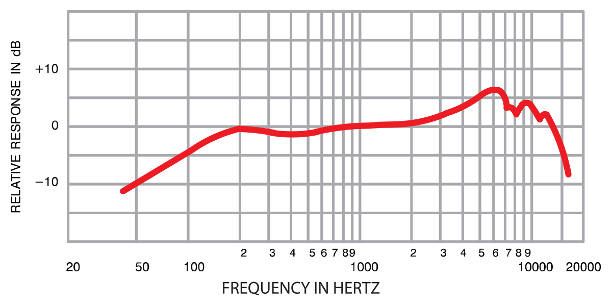
- Filtering effects from the microphone, as mentioned by @BenCrowell. The importance of this cannot be overstated. Consumer-grade computer microphones tend to have very "peaky" responses; they pass some frequencies much more easily than others. Even if the OP is using something more professional-grade, like an SM57, the frequency response is less than uniform:
Note that the nominal attenuation is > 5dB at 82Hz. That's under ideal conditions; low-frequency attenuation is also a function of distance to the speaker cone (and mic orientation, among other things). The manual recommends a 2.5cm placement (I believe the above chart was created under such conditions). Depending on their setup, the OP could be getting a dramatically different frequency response.
The location and manner in which the string is plucked. As mentioned by @fraxinus and others, this will emphasize certain harmonics.
The fact that the fundamental simply does not have to be the most powerful tone. Even though the fundamental is likely to be the most powerful, all things being equal, there is nothing that says it has to be, and your ear tends to perceive the tone favorably even if the fundamental is highly attenuated.


